Talamart Branding
At Tahadi Design, we believe that a brand's identity should resonate with its core values and vision. When we embarked on the journey to create a logo and branding for Talamart, we delved deep into understanding the essence of their business.
About Talamart:
Talamart stands as a marketplace dedicated to dry foodstuff. Their commitment to quality and authenticity is encapsulated in their slogan, "The marketplace that you trust.
Color Selection:
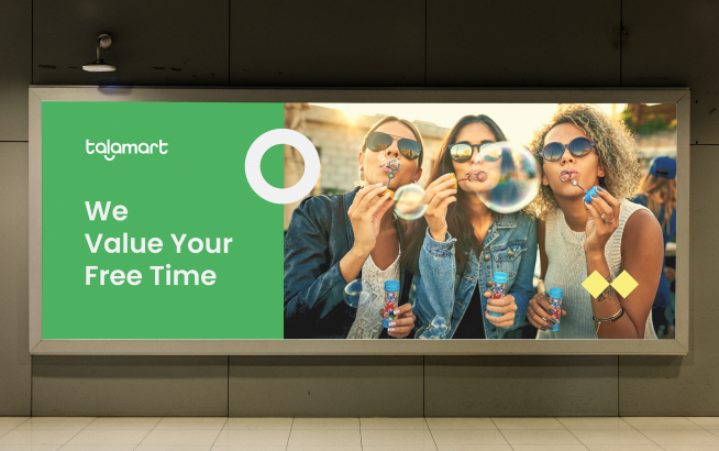
Green was chosen as the primary color for Talamart's branding. The color green not only symbolizes freshness and growth but also has a direct correlation with food, especially dry foodstuff. It evokes feelings of naturalness, health, and vitality, aligning perfectly with Talamart's offerings.
Typography:
To complement the brand's promise of trustworthiness, we opted for a modern, bold font. Bold fonts are often associated with strength, reliability, and assurance. This choice ensures that every time a customer interacts with the Talamart brand, they are reminded of its dependable nature.
Final Thoughts:
The culmination of our design choices results in a brand identity that truly represents Talamart's ethos. It's more than just a logo; it's a reflection of their commitment to providing a trustworthy marketplace for dry foodstuff.
We're proud to have been a part of Talamart's branding journey and are confident that this identity will serve them well as they continue to grow and establish themselves in the market.